What's up with the new Starbucks logo? And what does the future hold?

starbucks

Starbucks is rolling out a bold interesting new remake of their iconic logo. After 20 years, the coffee giant has decided to fiddle with the brand. In this new version, the words "Starbucks Coffee" no longer appear. Add to this a few missing design elements and a monotone color choice, and you end up with the new logo above. I think you'll agree when I say that a resounding "Meh" was heard around the world.

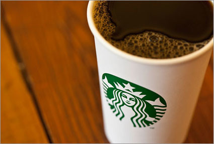
But, others have noticed an intriguing trend in the evolution of Starbucks' logo: magnification. That being said, I give you the past, present, and future of the Starbucks logo. I await the green dot with a full glass of iced tea. Won't you join me?

future starbucks

Comments

Justin said…
I hate the Starbucks woman/ goddess. She's just so smug. Bring on the green dot!
MrEricSir said…
I made the exact same joke a few days after you did. I guess that means you win.
toddx said…
I think the layout of yours is better. Excellent work.

Popular Posts